Thursday 20 October 2011

The Collector - The Making of the covers

It was our pleasure to recently work on two covers for the awesome book publisher Angry Robot. Dead Harvest and The Wrong Goodbye are written by Chris F. Holm and are the first books in The Collector series, a noir-tinged supernatural fantasy about 'soul collector' Sam Thornton.

The brief from Angry Robot was quite concise - they wanted to echo the famous Penguin crime novels designed by Romek Marber during the 60s and 70s, with stark images and a minimal colour palette.

First the first book, 'Dead Harvest', Marc Gascoigne, art director at Angry Robot, asked for a scene showing Sam in action - his arm plunged into a man's chest, harvesting his soul. We produced a few very rough sketches and then worked up the more successful ones into... slightly less rough sketches.


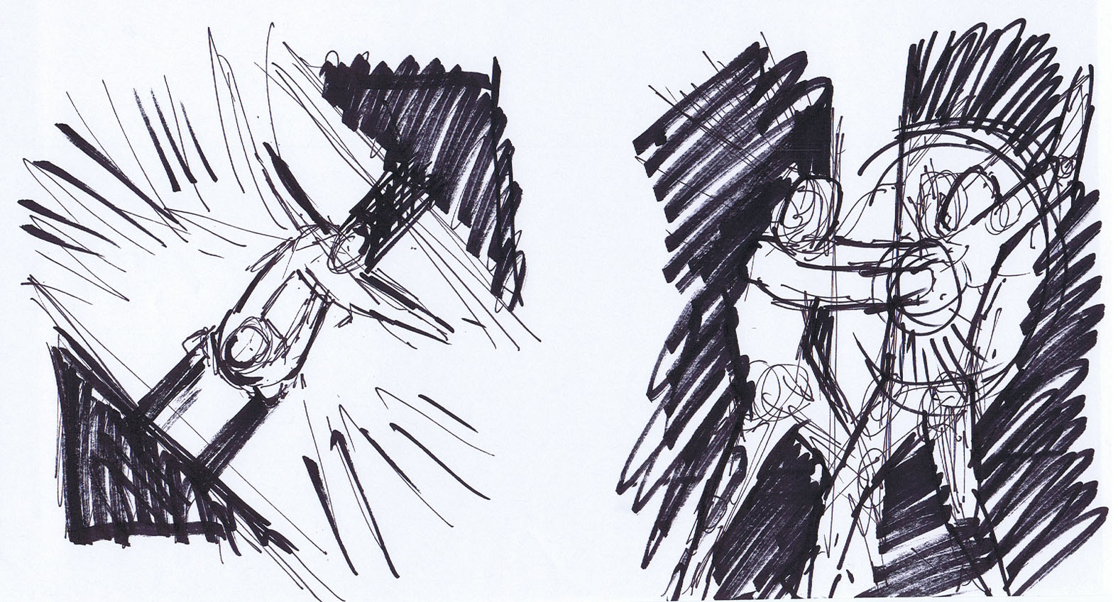
Above: the initial rough thumbnail sketches for Dead Harvest


Above: the slightly more refined sketches showing areas of contrast.
For the wide angle shot (pic 3) we pushed the characters even further away into the alley.

Each one was mocked up onto the cover template we had already designed based on the Penguin covers and sent over to Marc and Chris for their comments. The consensus was that this was the preferred option:

We originally used the circle of light as a shorthand for simply showing the light source in the image but it quickly became an integral part of the image! Next, using various bits of photo reference found online, we worked up a more complete sketch.

Above: Not entirely sure at what point the image became flipped. I think we realised that in the original sketch he was using his left hand. You'd have to ask Chris if Sam is a south paw but the image just felt more comfortable this way around.

This was scanned and then inked on a Wacom tablet in Photoshop. Other elements were added and then removed and then put back and fiddled with and then removed again and then thrown around the studio and then we made a cup of coffee and the cover went backwards and forwards to Marc and Chris a couple of times until, via a process we like to call 'luck', we got to this:


And there. Done. Except it wasn't. We'd grown so in love with the clean geometric loveliness of that damn circle that we tried something else:

Above: What's better than a circle? Two circles, clearly...

There. Now we're done.

So, onto book two, 'The Wrong Goodbye'. This one called for Sam to be surrounded by ghoulish looking people at the Day of the Dead carnival. The original brief asked for him to be in the middle of a row of people wearing skeleton masks, his face the only human one on display.

We tried some sketches along these lines but the problem with a line up of people is that it can look a bit flat on the page and it just wasn't gelling.

Then, fired up by our new found love of everything circular, we doodled this:


Aha! By putting Sam, lighting a cigarette in the middle of the circle he becomes both the focal point and the light source - just as he is on the first book - and putting the skeleton-people around the circle makes for a pleasing, geometric composition which again focuses attention onto Sam.

Above, right: A slightly more refined version of the previous doodle. This was mocked up onto a cover and sent to Marc and Chris for their thoughts. Luckily for us, they too love circles.


Above: the cover mock ups we sent to Marc and Chris. We also toyed with other colours.

We always knew that this cover would demand a great deal of picture research and we went all out looking for cool pictures of Day of the Dead revellers. Then, as with book one, we sketched up each of the characters, including Sam.


Above centre: Sam. Remember: don't smoke, kids.


With the pencil work done, we scanned everything into Photoshop and comped it all together.


Meh. It was kinda ok. There was something slightly off with it but we couldn't place what it was. Anyway, pushing such thoughts aside, we inked up the work in Photoshop using the trusty Wacom tablet exactly as we did Dead Harvest.

Above: Digital inking in progress.

No. There's just something wrong about it... and Marc and Chris got it. It's Sam. Oh god, it's Sam. There's something wrong with the drawing of him. As the central image he needed more presence. One of the reasons for doing each character individually and comping it all together was so we could pull it all apart again if we needed and so we took another stab at drawing him:


Ew, that's even worse. He needed to look more 'real' than we could manage by hand like this. We had trouble finding any photos online in quite the pose we were after so we knew there was only one way to achieve this...

Above: This is Martin, the Amazing15-er who project managed the Collector covers. Everyone say 'hi' to Martin. Martin doesn't smoke anymore so used a pen as a guide and we shortened it in the drawing stage.

Obviously Sam doesn't look anything like Martin, we simply used the photo to ensure we got the correct posture, hands, stance, arm shapes and head angle. We redrew the face. Even Martin doesn't want that face, why the hell would we give it to Sam?

With the new pic of Sam in place and working the rest of the cover fell together quickly and easily. And here it is:


And there we go. Simple! Sort of. Obviously we skipped over the long periods of banging our heads on the table and the shouting at the Wacom tablet.

It was a pleasure and a joy to work with Angry Robot, Marc and Chris on these covers. The patience, wit, imagination and enthusiasm they showed made the whole experience so much fun and I think together we managed to create a couple of awesome book covers.

You can preorder Dead Harvest here (for the UK) and here (for the US). The Wrong Goodbye is out in November 2012. In a week or so we'll post the 'making of' the Anno Dracula cover we did for Titan Books a few months ago...

Toodle pip!

- Martin (yeah, the guy in the photo)

Amazon #1

Just to capture this moment... Halo: The Great Journey (which we designed and show off in the post below this one) is currently #1 in Amazon.com's Graphic Design section. The book's been getting some great reviews too which is awesome. Smiley-face emoticon!


Friday 14 October 2011

Halo: The Great Journey - The Art of Building Worlds

In the earlier part of this year we designed an art book tie-in for the hugely successful Xbox game Halo. It's published by Titan Books and is chocked full of mind-blowing concept art from all the Halo games. There's also a special edition which has art by top comic artist Ashley Wood on the cover as well as being presented in a swish slipcase with limited edition art prints.

It was a big project for Amazing15 and it's great to see it finally out there in the world. It was a 'top secret' project so we were unable to show images or work in progress (if we even accidentally talked about it we had to do Men In Black style memory wipes) but now it's freely available we'll put some sample spreads below. It's picking up some great reviews and it's available from Amazon UK here and Amazon US here.


And here's that special edition. We went through several trial printing processes trying to get the effect we wanted on the slipcase. The thin gold metallic piping proved a nightmare to get right and we ended up printing backwards - instead of foil stamping the line-work, the large black areas were printed onto gold foil and then were matt laminated. The final result looks awesome and very classy indeed!


Friday 7 October 2011

Hello Kitty Fashion #2

The second issue of Hello Kitty Fashion is OUT NOW at all good newsagents! Designed by us here at Amazing15 it's 84 pages of cool clothes and make-up tips and features interviews with Tokidoki creator Simone Legno, pop band Belle Aime and much more. All this and it even comes with a free Harajuku hairband! SQUEEEE!


Tuesday 2 August 2011

"Elementary, my dear Watson..."

With a second series of the successful BBC reimagining starring Benedict Cumberbatch and Martin Freeman currently filming and a sequel to the Robert Downey Jnr and Jude Law blockbuster due for release later this year, the world is going Sherlock Holmes crazy.

Having already designed a series of reprint books detailing the 'further adventures' of Holmes (you can read about the design process of those, here), we were asked to work on a spin-off series of original novels.

Here's the final cover to The Breath of God, by Guy Adams. The brief was to design a cover which had a more illustrative/narrative feel – something which actually told the story rather than a collection of graphic elements like the previous series design. The second book cover in this new series, also by Adams, is currently under wraps, but it's a doozy...

You can preorder The Breath of God here

And here's a couple of covers from the successful Further Adventures of Sherlock Holmes series for comparison:


- Martin

Sunday 17 July 2011

Clarks 3D Comic

Grab yer 3D glasses! We recently designed a mini-comic for Clarks and Titan Magazines. It's a little magazine to keep kids entertained when they're dragged off to get their back-to-school shoes during the summer holiday (but what's gonna keep the parent's entertained, that's what I wanna know!) Clarks have two characters Jack Nano and Daisy and each of them has half the comic.

Here's the two covers. They are actually in 3D so if you have a spare pair of glasses kicking about dig them out!


And here's a couple of links to the Jack Nano and Daisy TV adverts which feature the magazine. Pick up a copy from all branches of Clarks now!

- Martin

Wednesday 1 June 2011

Sunday 29 May 2011

Poster!

This was spotted at Victoria station. It's the poster for Anno Dracula, a great horror novel written by Kim Newman. We did the cover, so it's great to see it up and out there in the world! You can read an excerpt here. Now go buy the book. Go on.


Also, check back in a week or so and we'll be posting a 'making of' for the cover, showing the various prototypes and alternative concepts we went through.

- Martin

Tuesday 24 May 2011

The Greatest Stuntman in the World

Vic Armstrong, the 'World's Greatest Stuntman (TM)' was on BBC Breakfast last Friday talking about his forthcoming autobiography. If you click this link, you can watch it (the interview with Vic is about ten minutes in). Failing that, look, here he is:


The subtitle of the book is also basically it's synopsis: "My Life as Indiana Jones, James Bond, Superman and Other Movie Heroes".

Vic's an amazing guy, with some incredible stories to tell of his time working as a stuntman for some of the biggest stars in Hollywood. The best thing is, he's still doing it - he worked on the recent Thor movie and is currently working on the new Amazing Spider-Man reboot.

It's a book well worth checking out - and I'm not just saying that because we designed it:


(Nice to see the beeb used the cover design as their backdrop...)

- Martin

Wednesday 4 May 2011

Doctor Who: Companion Chronicles - The Memory Cheats

One of the problems of working in publishing is that there's such long lead times and embargo periods on things, you have to wait ages until you can admit to having even worked on them!

There's some hugely exciting stuff I'm dying to post online but it'll just have to wait. In the meantime, to whet your appetite, here's a CD sleeve we did for Big Finish a few weeks ago. It's especially timely since the new series of Who has just started on the beeb (and if you'll allow me to geek out momentarily… IT'S FREAKING AWESOME!)


– Martin

Tuesday 15 March 2011

Icons

Huzzah! A book I designed for Titan last year has been nominated for an Eagle Award! Icons: The DC and Wildstorm Art of Jim Lee is in the running for Best Comics-Related Book.

If you have a moment, please pop along here to vote for it! Here's some images from the book:


You can see more at our website: amazing15.com

There's also a rumour circulating it might be up for another, even more prestigious award... More on that as we get it!

- Martin

Thursday 24 February 2011

Sucker Punch Review #2

The Art of Sucker Punch, a huge doorstep of a book designed by myself for the upcoming movie, has been reviewed on cult nerd site AintItCool. Here's a screen grab of the review - click to embiggen (or click here to visit the site). Nice!

Mart